Kit launch day is one of the most exciting days for most football fans, as it gives them a glimpse of how their favourite team will look in the upcoming season. Despite a very short turnaround between the 2019/20 and 2020/21 Premier League seasons, due to the delayed restart and finish of the season, we are now beginning to see most clubs’ come out with their strips for the upcoming campaign.
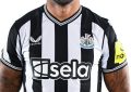
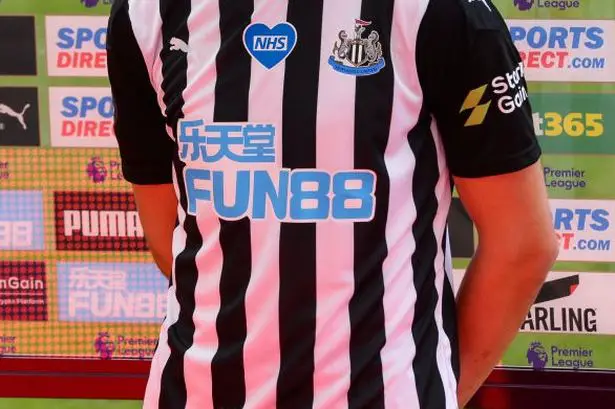
Many teams also have new principal sponsors on the front of their shirts, however Newcastle United is one of the biggest teams to renew their past sponsorship. FUN88, a company dealing in gambling casino games and sports betting, are the once again primary sponsors for the Magpies, having agreed a long-term partnership earlier this month. This deal marks yet another instance of a gambling operator having a shirt sponsorship deal for a Premier League club, with almost half of the teams having such a sponsor on the front of their shirts.
As always, there are some great designs out there, with a fair share of wacky and weird attempts as well. We’ll have a look at the new kits for all the Premier League clubs now, highlighting some of the best and worst of the lot.
Newcastle’s home kit is quite bog-standard, with the usual black and white stripes featuring once again on the home strip for the Magpies, with Puma as the kit manufacturer. The away shirt is in light lemon yellow, with a black trim from the neck to the shoulders, while the third kit has blue triangles interspersed with diagonal black lines across the shirt. One of the best kits of the new season is Arsenal’s home shirt, where the traditional red and white template has been jazzed up with a snazzy pattern. A white round collar and white sleeves, with double red trim, adds to the funky look. The away shirt is good as well, featuring a light pink background with red veins of colour snaking across diagonally. The Arsenal crest is in black and white, making it stand out on such a background.
Chelsea’s home kit had already been seen towards the end of the previous season, with new principal sponsors Three featuring on the shirt. The away kit is in light blue with a wave pattern, while the third kit is rumoured to be in red with blue stripes, not too dissimilar to how a Crystal Palace shirt might look. Palace, on the other hand, have flipped the template of their standard blue and red stripes, with the stripes starting from the middle of the shirt, rather than the top. It is the same pattern for the away kit and third kit as well, where the away kit is in white, while the home shirt has a blue background, and the third kit has a black background.
Manchester United’s new kit has drawn a divisive reaction, featuring a snazzy red pattern with the distinctive Adidas three stripes on the shoulders. Manchester City, too, have seen some curious fan reactions, as their home kit has a white patchwork, resembling cracks, all over it, with a white half-collar. The away kit is no different, as Puma have served up a pattern design reminiscent of a sweater, while the third kit has blue patterns on a white background which has drawn the most ire. Champions Liverpool have freshened things up with an aquamarine blue trim on their collar and sleeves for the home kit, with that colour then being used for the away kit, which features a wave pattern.