


Leaked photo of new Newcastle badge design - A bizarre twist on current crest?
48 hours before one of the biggest games of our Premier League season, perhaps the last thing the Newcastle fanbase needed was an immensely divisive announcement from the club itself.
But on Friday lunchtime, exactly that happened. The club has issued a statement proposing to change our iconic crest, which has been in place since 1988 and stands out as one of the most unique in the Premier League.
And now an image has emerged of one of the proposed new designs, and it's fair to say that if Friday's 12pm announcement went down poorly, this is unlikely to boost the mood anytime soon!
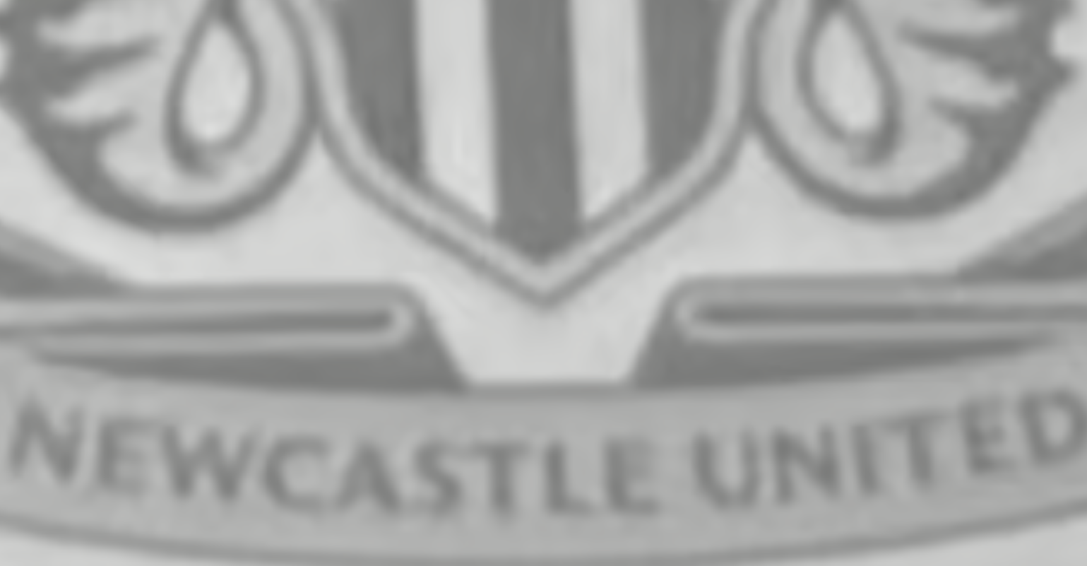
Image of one badge proposal 'leaked'
Exclusively revealed by NewcastleWorld and rapidly spread on social media, the concept image still depicts the seahorses and different elements from the city’s own coat of arms - but at this stage still looks like a needless design update.
Additionally, NewcastleWorld’s Liam Kennedy writes: "The proposal design was drawn up prior to the fan consultation process", hinting that the decision has been in the pipeline for some time. See it below:
In their Friday statement, the club put out the following message to fans: “As our club grows on the global stage, the symbol that represents us needs to be able to keep pace. It needs to show up clearly and confidently across everything - from kits to screens to merchandise.
Adopting a 'Refine & Revive' approach, the club is now seeking input from season ticket holders and members alike in terms of the new direction and design.
But whilst fan input will no doubt be incorporated into the final design, it looks the club and its design team have already drafted up several concepts over what the new crest could look like.
The biggest mishap yet by the owners?
Whilst the proposed move from St James’ Park had many critics - though the justification of being a massive revenue booster partially excused it - the general consensus within the fanbase now is that there is little logic behind changing the club crest.
It’s from here that the club has to be careful with how it approaches the final design.
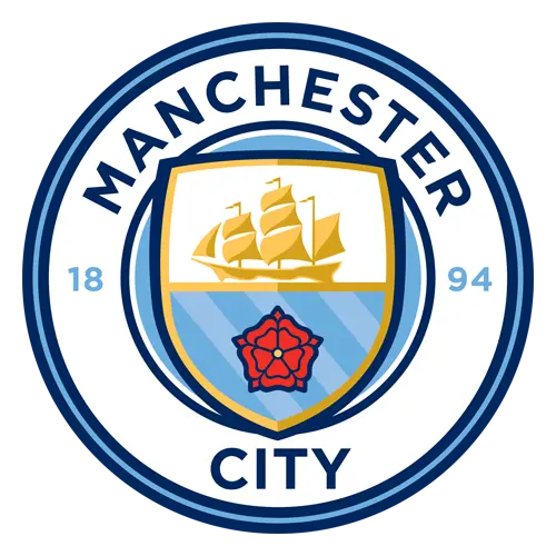
If it’s like Manchester City, who reverted back to a circular design which it had previously, and tapped into Manchester’s industrial and shipping history, then this will satisfy portions of the fanbase.
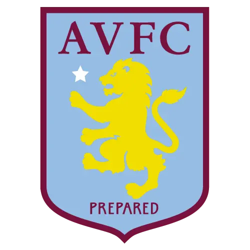
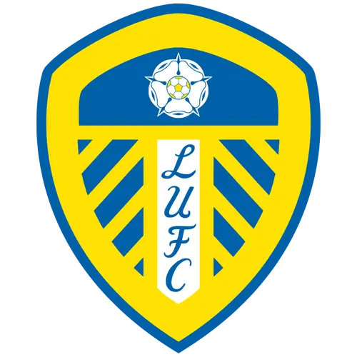
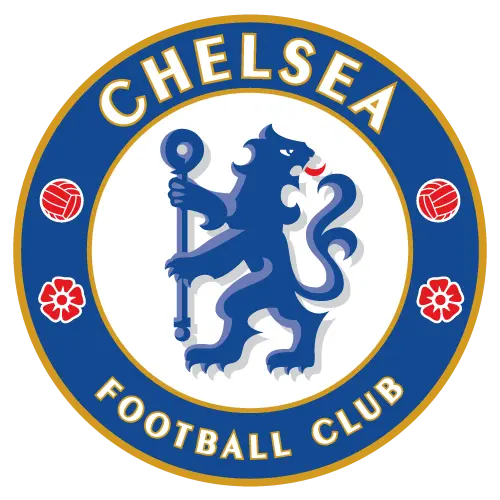
However, should they strictly go with a simplistic circular design, similar to that of Aston Villa and Chelsea’s recent crests, or even delve into Leeds United circa 2018 for a laughably unusual design, then this will feel like the biggest misstep of the current owners so far into their tenure.