What do you think of our new home kit?
Newcastle have unveiled their new kit for next season today, and on first inspection I have to say that I'm not massively keen on it.
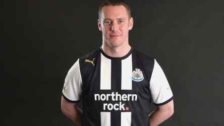
It's the same kit that was leaked a few weeks back, which is disappointing as I had hoped that those leaked images were a pisstake. Apparently not. As pictured, it has just the two white stripes and is predominantly black on the front with those 'iron on' cheap, tacky sponsor and club badges still featured. It reminds me of a West Brom kit in all fairness.
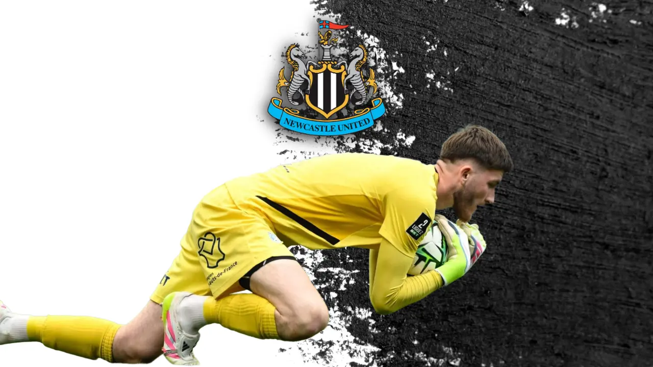
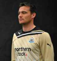
And how about our new goalkeeper shirt? What are your thoughts on this? It is very similar to the current Tottenham Hotspur home kit in my view.
In fact it could well be the Tottenham home shirt that has been bathed in a tub of urine to achieve that incontinence yellow effect.
We've had three new home shirts in three seasons now, and I've only bought one of them - the Adidas one!
In my view the stuff that PUMA have trotted out is pure pants. It looks shocking, feels cheap and tacky and is doing nothing to justify me shelling out £45 or whatever it costs on one. Needless to say that next season will be another season where I stick to my retro shirts. It's a shame my 1993 shirt is more like a boob tube these days as I quite liked that one.
Anyway, the decision has been made and won't be changed so we have to stick with it. It doesn't mean you have to buy it though, unless of course, for some strange reason, you actually like it.
The official club website is offering a free home ticket with a pre-ordered shirt for a limited period of time as some form of sweetener.
A free season ticket wouldn't be enough for me to buy that!


